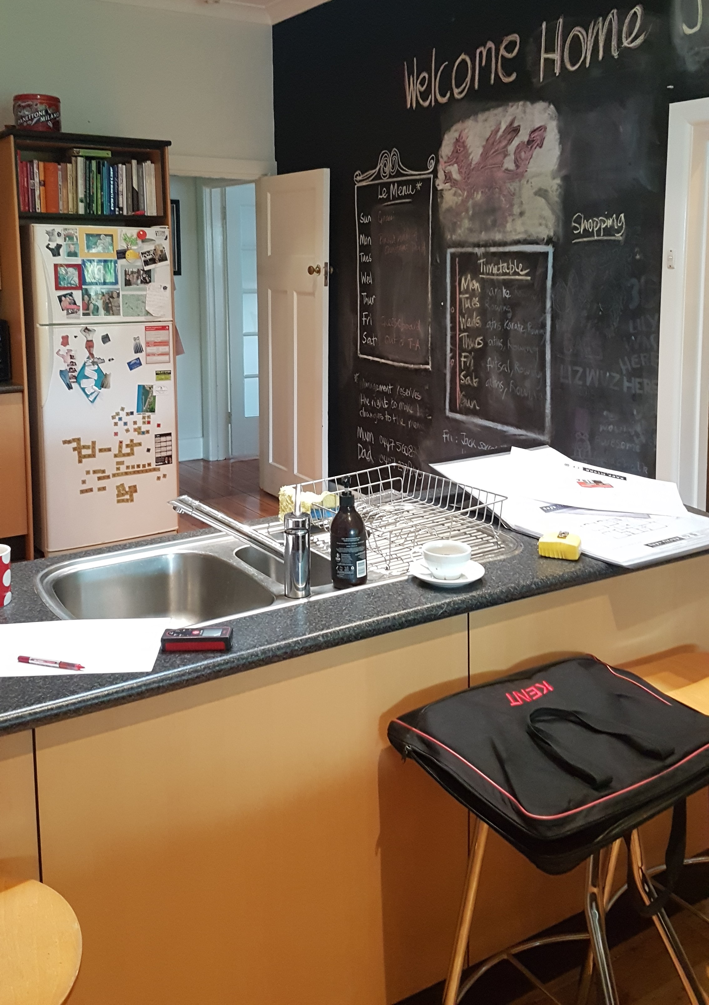
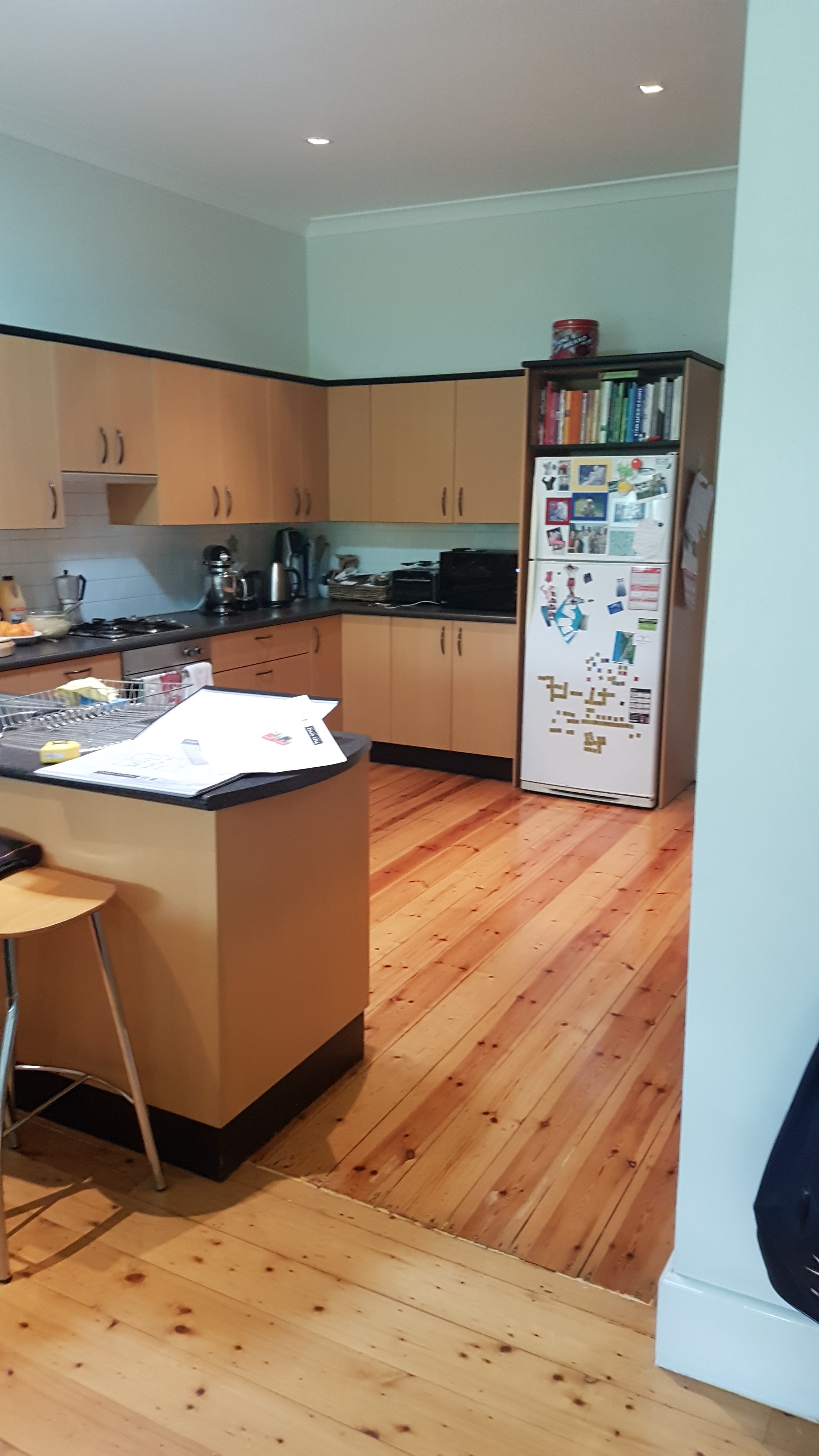
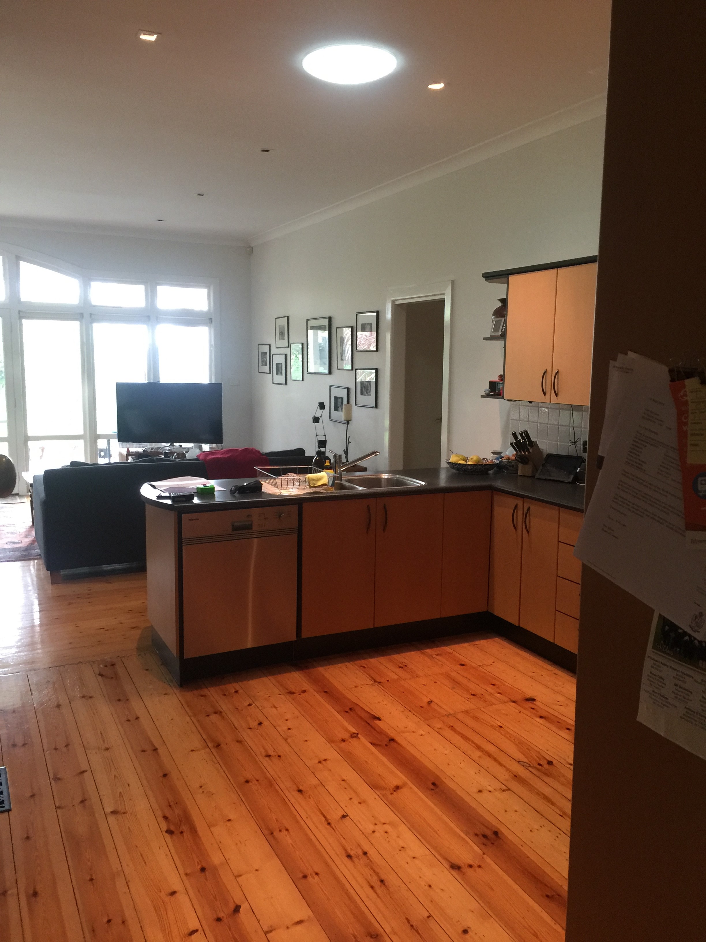
This project involved opening a large section of wall. Our client’s home is of the Solid Brick type and carries a second story on above. So steel columns, steel beams and an Engineers assistance were a must.
U-Shaped to Straight Kitchen
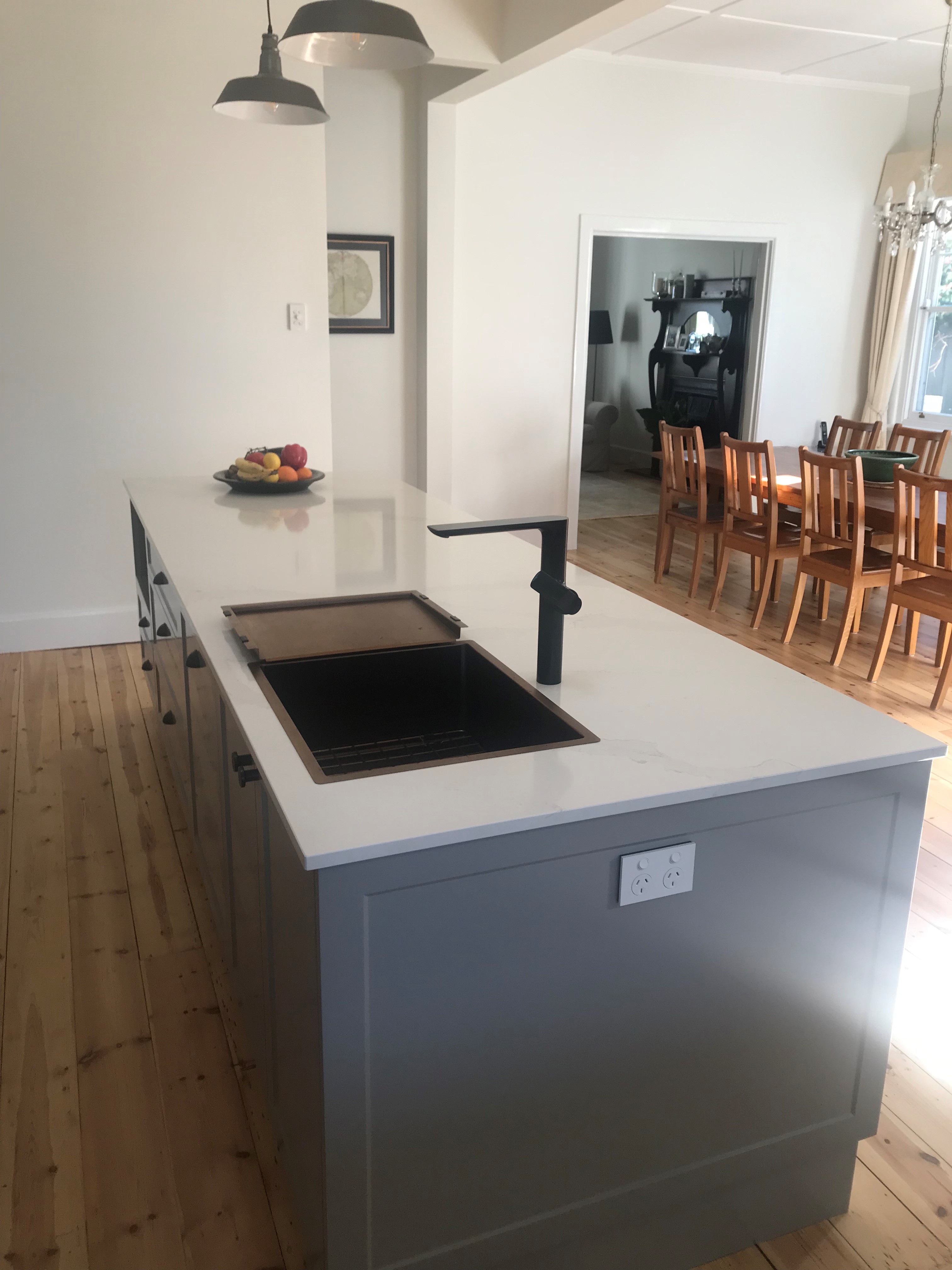
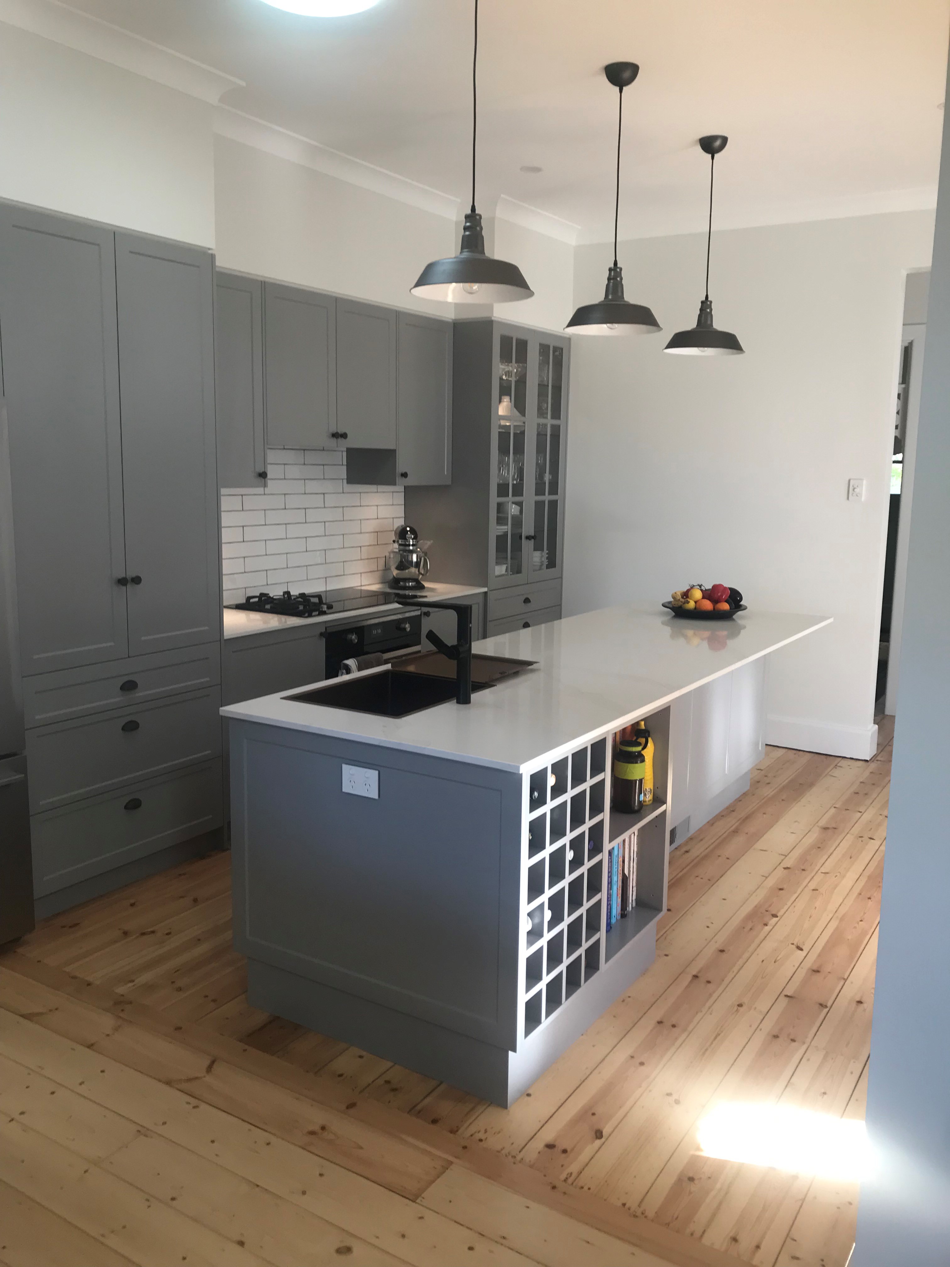
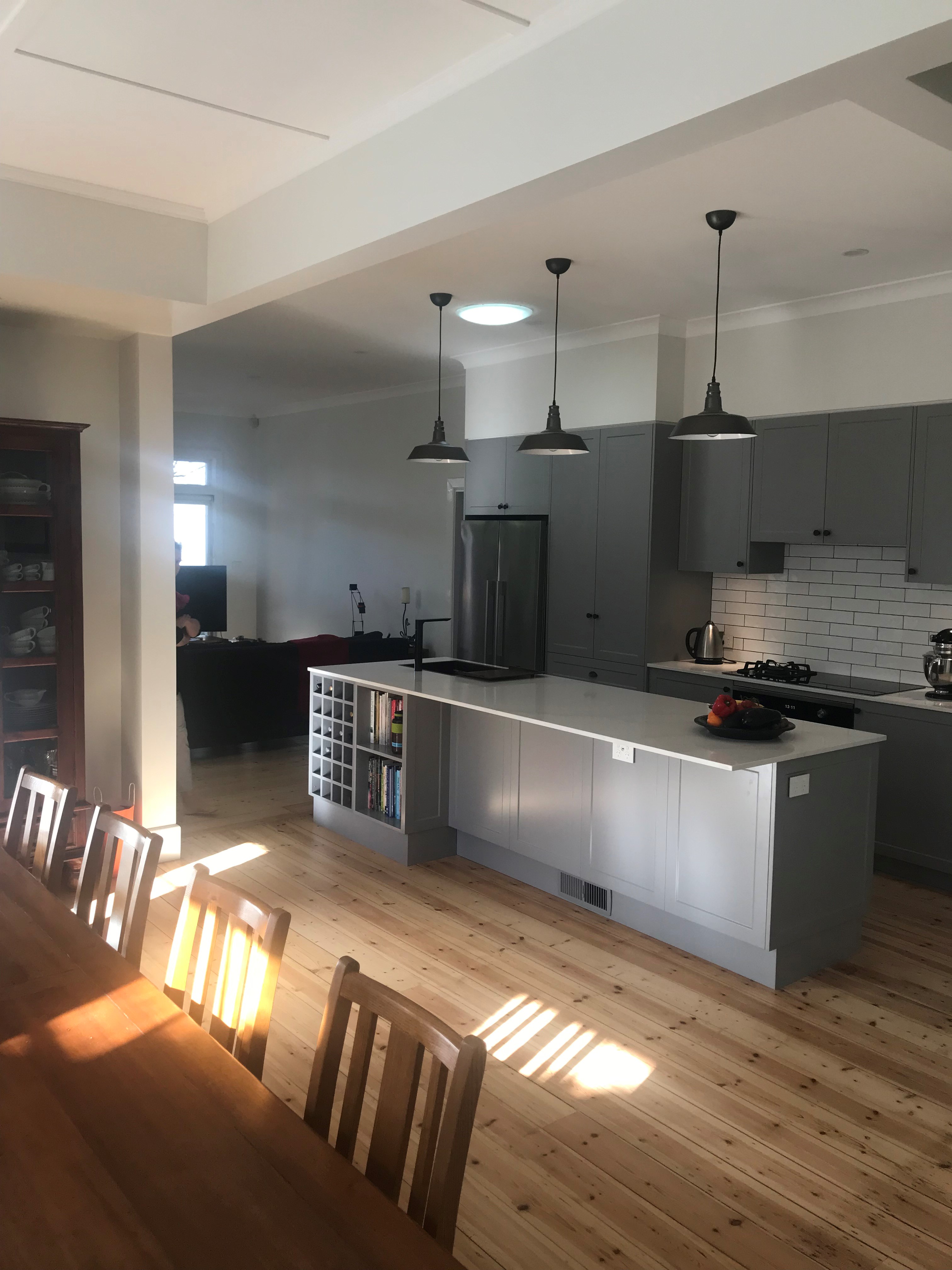
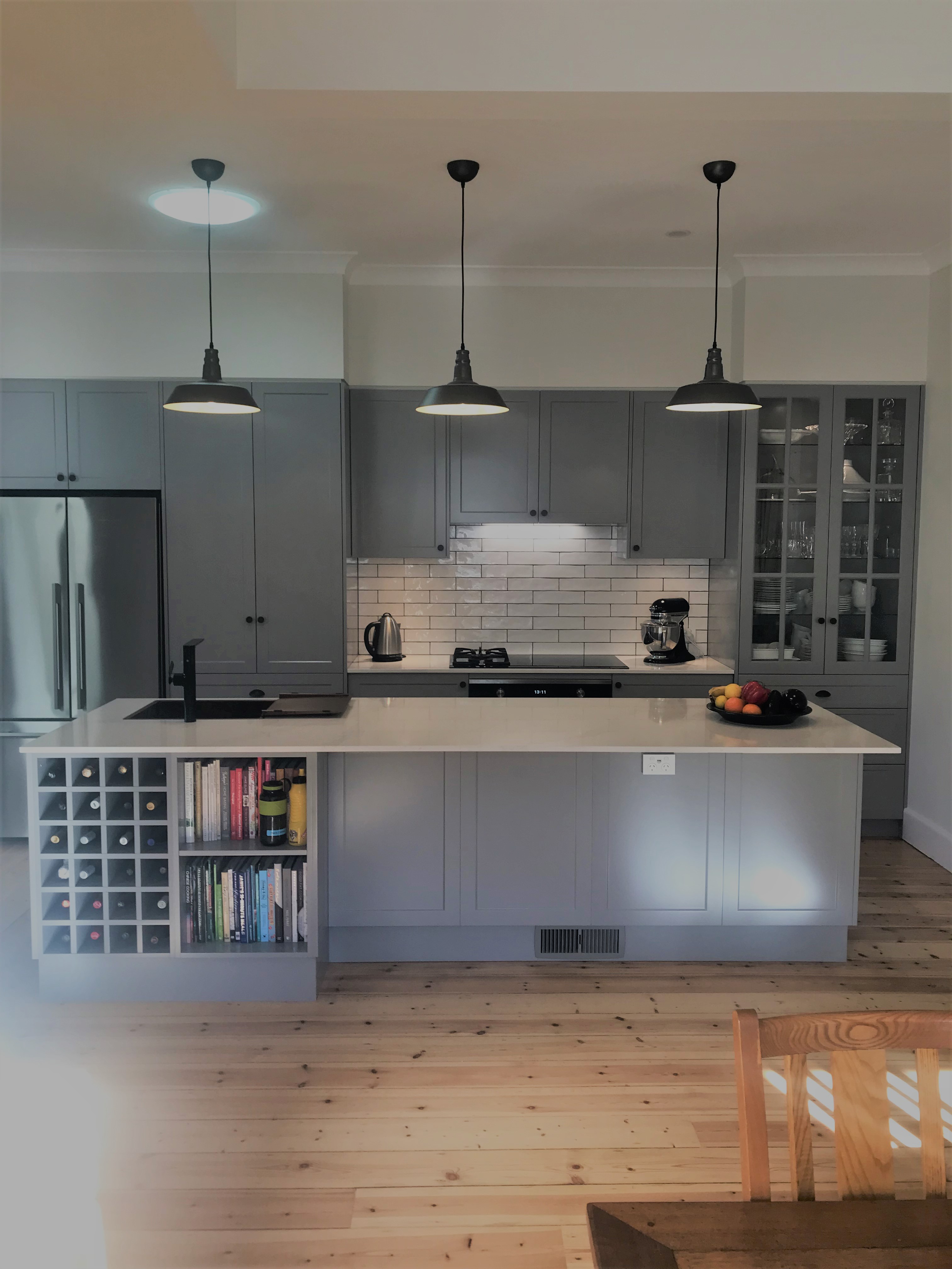
As we often do, the U-shaped kitchen was removed and a straight kitchen with an Island bench was used to replace it. Island benches lend themselves well to pendant lighting. The three lights chosen by our client’s astute eye were perfect for the style and colour scheme. A Matt Black sink was the obvious choice for this colour pallet.
Symmetry
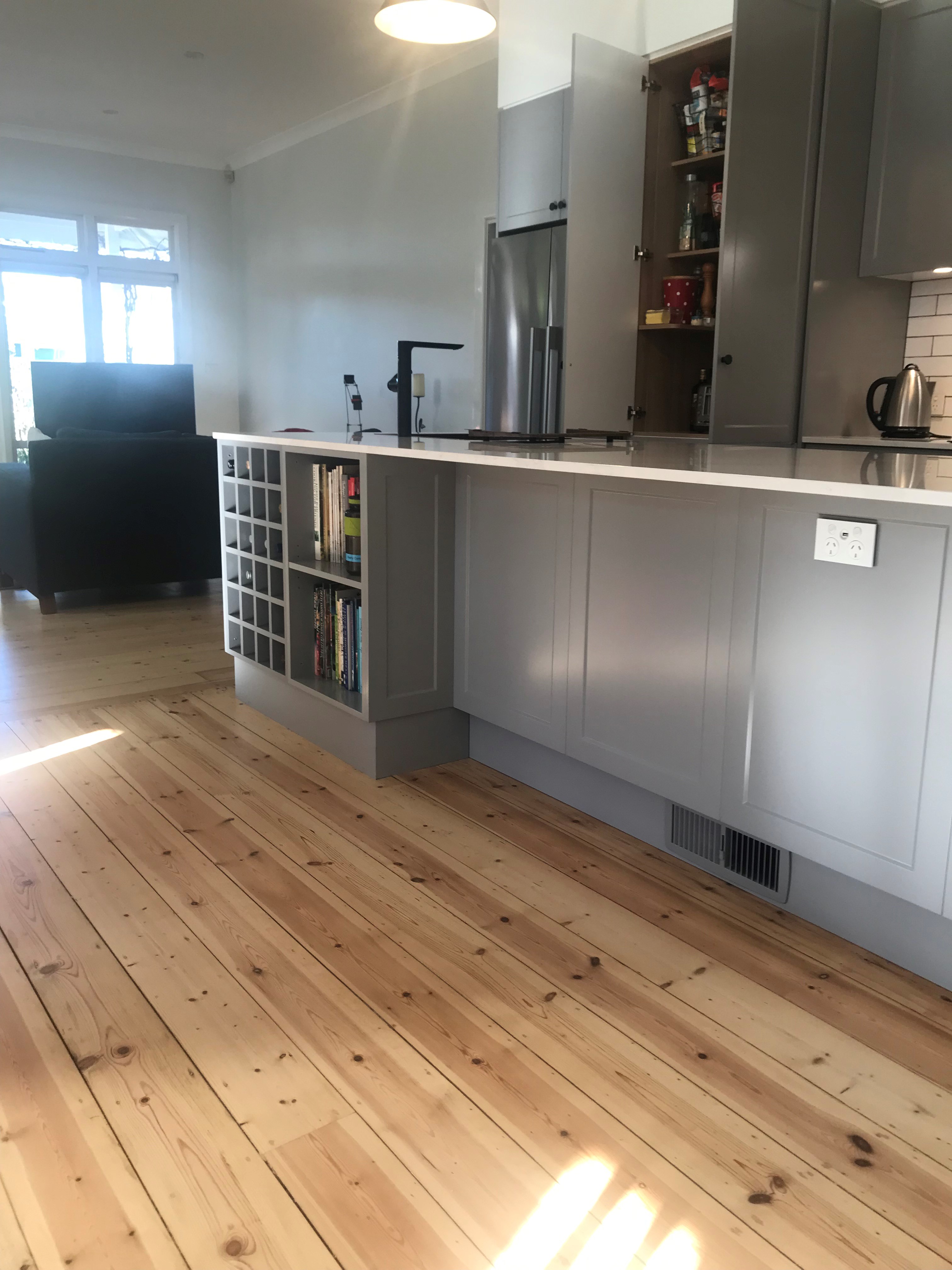
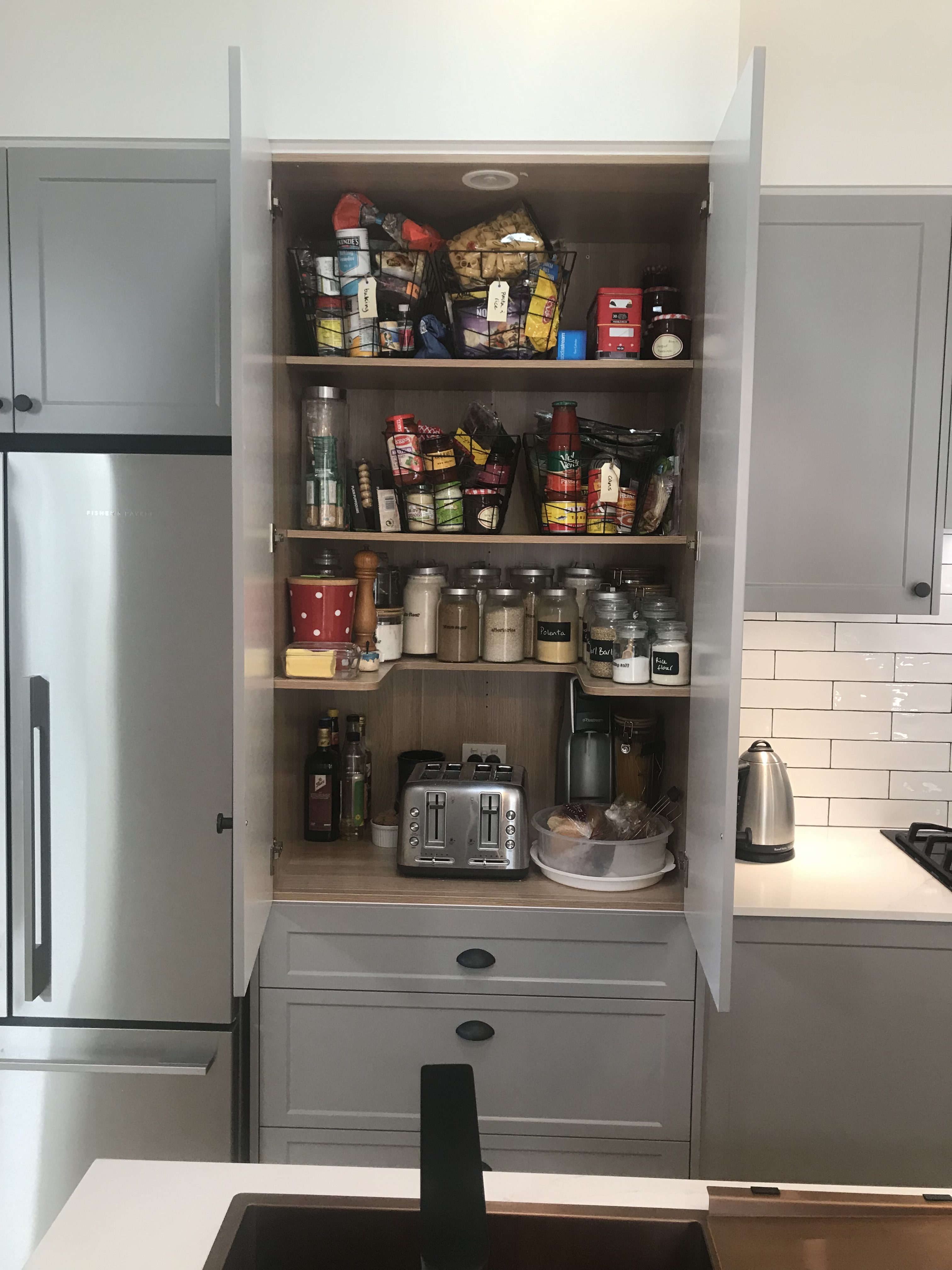
We positioned the cooktop in the centre of the main run making it easy to place a pantry on one side and a display cabinet on the other side. With enough seating for the family on the back of the Island already we chose to fit wine storage and decoration area at the left-hand end.
Consistency
Once the Large wall was gone, space felt far more free and friendly. Light now floods into the room where there was none before. We used slump white subway tiles and grey grout to keep in with the theme. Stone benches were selected from the Caesarstone range, Eternal Calcutta Gold.
Flooring
Taking out walls always leaves a bit of a mess of the floors. This home had been renovated a few times and flooring was running in a few different directions. The timber had also discolored over man years, leaving it quite orange. We used an acrylic polish to keep the tone as light as possible.
The door style is a Janper Thompson and it is painted using a 2pac satin finish. Using paint gave our client the ability to have the exact colour they desired.
Extra Tips
The inside of cabinetry doesn’t have to be white. Many of our clients choose to have a colour or pattern inside. Shelves can also be curved or contoured to suit your preference.

