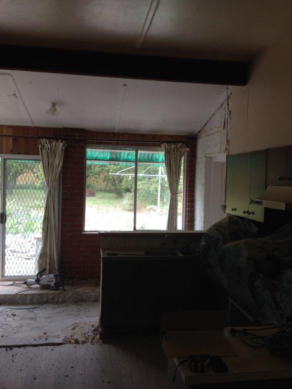
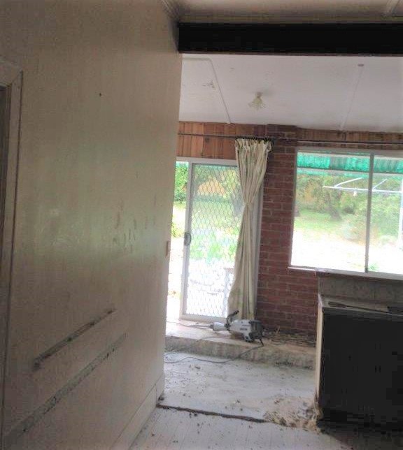
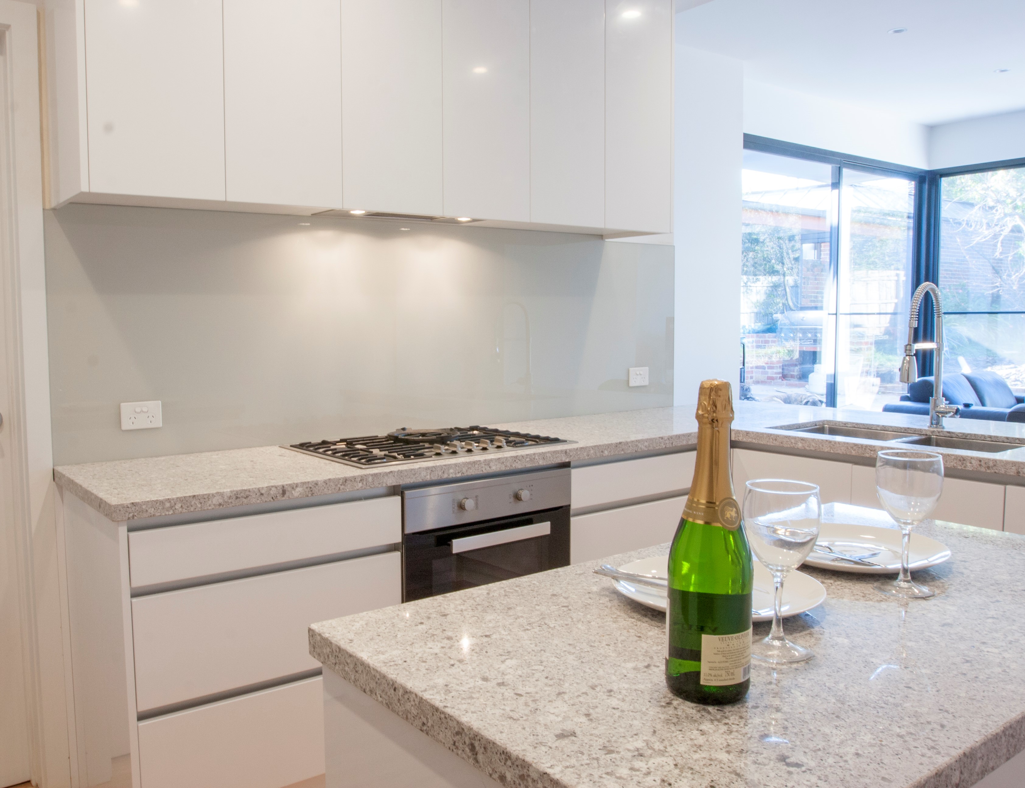
This Before and After project is a simple kitchen with a lot of change to the room. The doorways were not in the best place, so we moved them to create a better flow through the space. The back of this home possessed a lean-to that was tired and very ready for upgrading. We raised the ceiling in this room to come in line with the rest of the home.
To overcome the darkness of the room, bigger and better windows were fitted. Brickwork, wood panelling and painted brick were all replaced with standard plaster appearance. A mix-match of Windows, flyscreen’s and 70’s curtains were streamlined to all matching aluminium framed, double glazed windows.
Should the kitchen move?
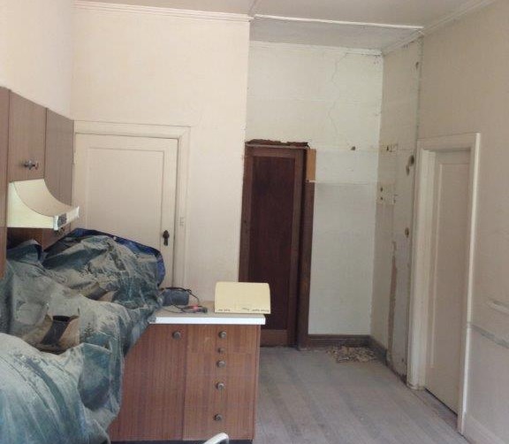
Sometimes, no matter how hard you try, the existing kitchen just won’t fall in line. So we consider moving the kitchen location to another, more practical area. This scenario definitely needed to change.
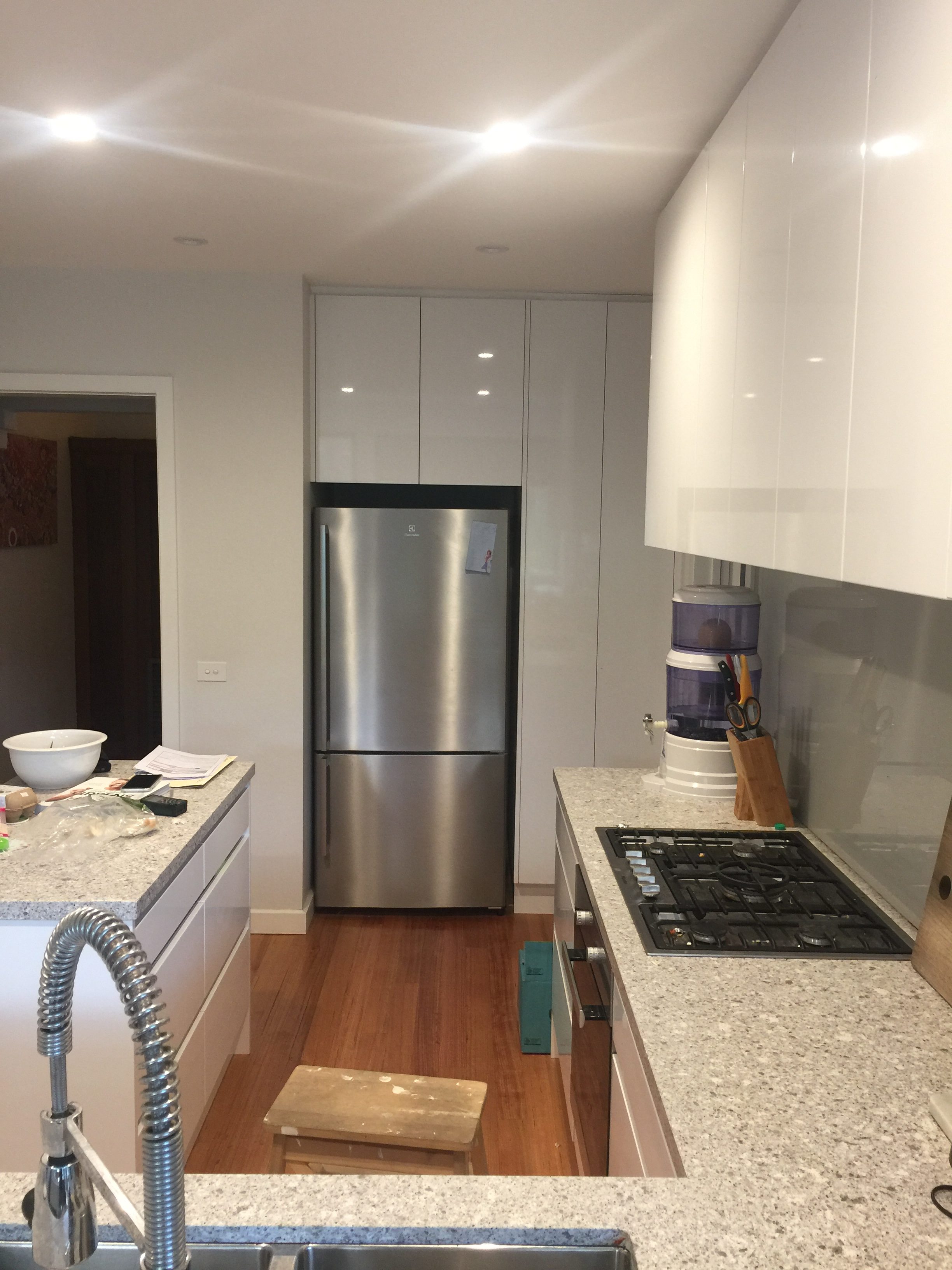
The existing kitchen had been badly placed in the room and needed to be moved across to the other side. There were also too many doors in too smaller space. So one door was put out of commission giving us a great place for the fridge and a large pantry.
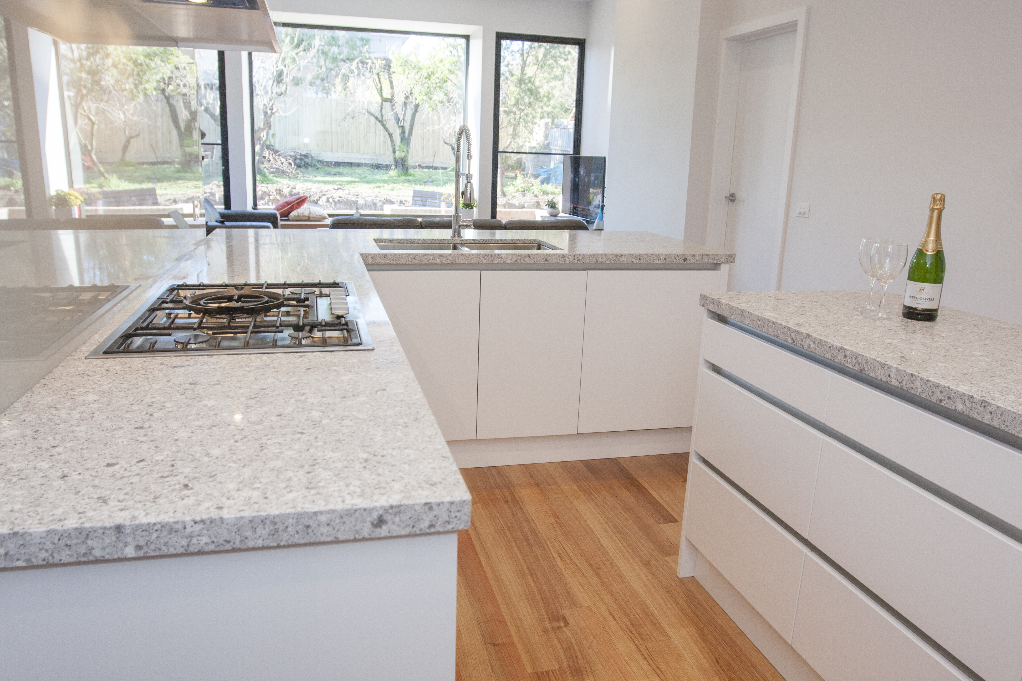
Our clients wanted a modern white kitchen with chunky looking stone benches. Bright white overhead cabinets with a concealed Range Hood kept away the dark and dingy feel from before. A hint of colour in the splash backs and rich hardwood timber floors keeps a warm feeling alive. An enormous kitchen tap provides a focal point.
Coo 3 & 3b
Handles or Handless
A minimalist handless white kitchen with stainless steel handle recesses worked in well with the stainless-steel appliances and stainless-steel tap. With the changes to the room, doors and windows, the view to outside is now much more pleasing on the eye.

